Searching for stability in your pricing model


Everyone dealing with models at some point becomes interested in the model stability. It is a truth regardless of the fundamental model structure (e.g. GLM/GAM, ensembles of trees), its purpose (regression,classification) or even the field they work in (insurance, banking, etc.). It simply follows from the very core of the modelling idea – the model is just a point of view written in mathematical form which aims to capture the essential behaviour of the process it reflects. By essential behaviours we mean the expected value and general dynamics. Otherwise, if the model recreates the data more accurately, we talk about overfit, which clearly is not what we are looking for.
The models used for prediction cannot simply recreate the data they have, they must also be robust enough to accurately predict the behaviour in the case it has not “seen” in the training data. The idea that a predictive model should behave similarly regardless of the given data sample is at the centre of the idea of stability. But what exactly is it and how to measure it?
Understanding the basics
Stability is a complex term which covers several areas. In a broader sense, stability refers to the ability of a system, model, or process to maintain its behaviour, structure, or performance over time, despite the presence of disturbances, changes, or variations in conditions. The key components of it are:
- Resistance to perturbations – when a small change yields a proportional deviation from the expected behaviour.
- Resilience to parameter changes – when a small adjustment in the key parameters does not result in significant change in the output.
- Consistency over time – the results remain predictable over time, even when the conditions vary.
And there are several different kinds of stability, e.g.:
- Static stability – when small changes in the inputs lead to small changes in the output.
- Dynamic stability – when a system returns to its equilibrium after being perturbed.
- Numerical stability – in computational contexts, numerical stability refers to the accuracy of algorithms when subjected to small changes in input or precision.
- Structural stability – when a system or model retains its qualitative behaviour when subjected to small changes in its structure or parameters.
Now that we clarified the topic in general, let’s restrict and reformulate the definition to the components of a pricing model. As we develop a tariff there are risk and demand (not only!) models involved. It does not really matter what technology we use there – whether it’s a simple or more complex GLM/GAM, something based on decision trees or a neural network – there are some properties we expect from all of them, e.g.:
A. The model should perform equally well on datasets it has not “seen”.
B. The model parameters should not vary much as the training data changes, due to a moving time frame (5 last years) as an example.
Obviously point A relates to consistency over time, and B relates to both resilience to parameter change and structural stability (retention of qualitative behaviour under small changes in parameter). And all of them are crucial for a price model which is reliable in the sense we can expect slight changes due to pattern shift in the underlying data when we retrain the model in another period. However, a demand model is not really expected to be super stable over years. On the contrary - we would expect it to quickly adjust to new market conditions arising from an unexpected even which impacts demand. Let’s use this understanding of the stability as our anchor.
Recognising the issue
As it turns out, in modelling in general, stability is not an obvious feature of a model. I mean the model always depends on its complexity and the data used for training. A simple (weighted) average is very stable due to the strong law of large numbers (remember from the probability introductory courses?). A model with many degrees of freedom might have less stability and it is a simple consequence of the rule that with increasing intricacy the model tends to an overfit.
We can think of it this way: the amount of data (both number of variables and rows) is a currency for which we buy model complexity (the degrees of freedom) so if we have a more sophisticated model built on less rich dataset, the model is built “on credit”, for which “interest” will have to be paid in the form of overfit.
An overfitted model is much more dependent on the training data than a simpler one. Hence, the perfect model would balance the complexity and accuracy, so that the predictions are stable and accurate. But how do we measure the stability of a model?
One of the tools, which seems to be a default now, is validation on another dataset. This is usually a portion of the dataset prepared for training, which becomes reserved for model evaluation after the fitting procedure on a reduced dataset. It is good practice to have a reasonably sized validation dataset so that the analyst can see how well the current state of the model performs on “new data”. The data the model has not “seen” should be assumed to be a typical situation in insurance, where risk factors usually come in such detail, that only a fraction of all possible combinations are materialised in the dataset.
Validation helps us control for both accuracy and overfit. One could do it visually or numerically (see our blog post about creating the best possible risk model) – the same techniques to evaluate model fit on the training data could and should be used on the validation sample as well. In the process we calculate metrics like Gini score, MSE or information criteria and draw charts. We know how to interpret them on a dataset. However, in the validation process we compute and plot them for both training and validation sample. Some analytics (e.g. Gini score or MSE) can be compared between different datasets and some are calculated as a total sum (e.g. Bayesian or Akaike information criteria) and we cannot simply compare them. On the other hand, a chart might show us a difference in shape which indicate different dynamics. A measure of stability would be a difference in comparable metrics or in plot line shape.
As we go back to the initial considerations on the stability itself we see this approach fulfils only the part A. of the definition we assumed, i.e. the final model will behave well on new data. This method tells us nothing about the behaviour of its parameters when the training data change (part B.).
For this we need a stronger tool.
Finding a solution
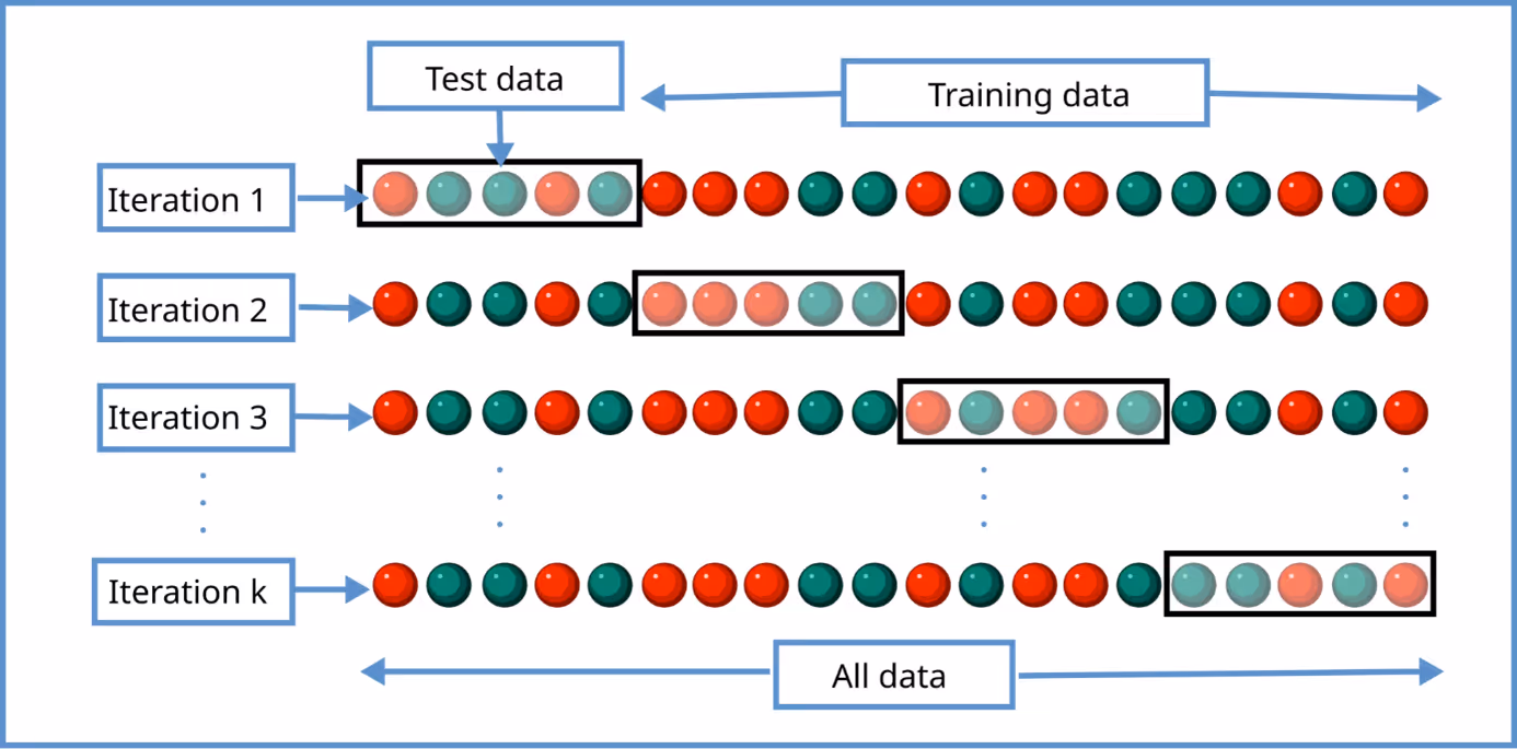
Let’s imagine a better way to capture model stability. We know we expect a similar behaviour on new data like in typical validation mentioned above, but we need to investigate the behaviour of the model when retrained on shifted data. Instead of splitting the training dataset into two unequal parts, we could split it into several equal parts (possibly equally distributed samples). Then for each part (which we call a fold) we take it as a validation sample, and on the rest we retrain the model with the same assumptions on variables and transformations used, offsets of coefficients, hyperparameters and so on. The resulting model is analysed, we extract some measures and interesting insights, and move on to the next fold. In the end all data gathered in the process is analysed together to spot inconsistencies and divergence.
That in a nutshell is the idea of cross-validation.
Now let’s talk about particular metrics and visuals we can use to extract most insights from the information collected.
Measures
The most compact information are metrics which reduce full model complexity to a single number which is easy to interpret and compare:
- Gini index,
- information criteria (AIC, BIC),
- mean squares in all variants (MAE, MSE, RMSE, with percentiles, and so on),
- deviances (Poisson, gamma),
- and others
As an example, let’s think of a sequence of Gini scores or mean squares. These will immediately show significant differences in performance. When predictions of a model retrained on another sample tend to be higher or align better with extreme target values, the mean squares may increase noticeably. A significant drop in Gini coefficient may indicate that a new model recognises less complexity in the data leading to different dynamics in prediction.
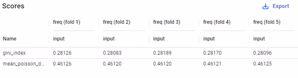
Of course, these need to be used carefully, as they often cannot be used standalone – only in the context of the same model and its variants. Here fortunately the context is perfect – all models have exactly the same structure and are only trained on a somewhat different sample.
As we analyse these sequences in the end, we look specifically for inconsistencies: how often do they appear? how much differ the values? Often quite helpful are mean and standard deviation of the measures.
Pro tips:
- evaluation based on mean and standard deviation of results of cross-validation is a good tool for automated searches for the best hyperparameters;
- usually there is no need to perform cross-validation on more than 5 folds. However, if you’re interested in longer sequences, e.g. 10 or 20 folds, chart the resulting measures and investigate their distribution. This way you can analyse the uncertainty in the measurement itself and understand how much they can vary as the training & validation samples change.
Model parameters
As we remember from the basics, one of types of stability is structural stability, which in our case is strongly connected to the property B (the model parameters should not vary much). A stable model will not admit large fluctuations in the coefficients when the data does not undergo similarly strong changes. That is why it is always a good idea to analyse the model parameters per fold.
All we have to do is to extract the coefficients of model on each fold, group them consistently (e.g. per variable, level, etc.) and put in a shared table. This way we get a lot of numbers to look at. What is most important is the behaviour in each variable: look for discrepancies in signs, deviations in values. E.g.:
- if a coefficient is in general close to zero, but in half of folds it comes out slightly positive and in the rest slightly negative – then maybe the best choice would be to make it equal zero? The final decision depends of course on many other factors like it’s general impact (maybe the coefficient is close to 0.00001 but is applied to large numbers like 100000).
- If a coefficient has large deviations in values, they might results in sudden price increase for a policy. The change might not be adequate to risk, but stemming from essentially random shifts in the training dataset.
- if p-values computed for the coefficient do not keep consistently the assumed significance level, maybe the variable or level should be excluded or treated differently?
The list above is not comprehensive, just 3 ideas from the top of my head. We should look for attributes that are important and focus on finding inconsistency, which may suggest a way to treat the variable.
A note about estimator type: of course in insurance pricing the most commonly used are GLM/GAMs, which have a “manageable” number of coefficients, but in case of general machine learning the situation is much more challenging, if possible at all. Typically used GBMs can have much more parameters than linear models (hundreds of trees and each having many nodes and leaves). Their interpretation is also different – not a relativity or a coefficient in a linear predictor, but a sequence of nodes and leaf values for multiple different trees. It might be hard to find a way to organise them and extract useful, actionable information. Similarly, in case of neural networks the matrices hold tens or hundreds of thousands of coefficients and the sheer number of parameters make it impossible to analyse this way.
Visuals
In the last section I’m going to mention charts in cross-validation. Here the situation is a bit different. There are some issues which we must be aware of. If we want to plot the models in a single chart, we face the following difficulties:
- as each fold has different train and validation samples, to make a meaningful comparison, we need to find another dataset shared by all models – the plots should show behaviour on the same data;
- with 5 folds or more we would have at least 5 lines to investigate which is a quite complex task – charts are powerful, but only if clearly readable;
- the variations in predictions on each fold can be quite small when averaged and that is exactly what most of the plots are doing – showing average value;
- when analysing differences between models, focus on differences to the base model, or otherwise you end up with too many charts to base your decision on;
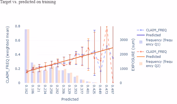
Regardless of that, one of potential use cases here is overfit detection – as I mentioned above, the expectation is that differences between models will be small and as we average them out there will be not much to see. However, in a situation where the discrepancies are clearly visible – it is a strong indication that model parameters depend too closely on the dataset used in training. Use a one-way kind of plot. An additional option would be to plot residuals over some variables. This will allow to identify areas where overfit likely happens.
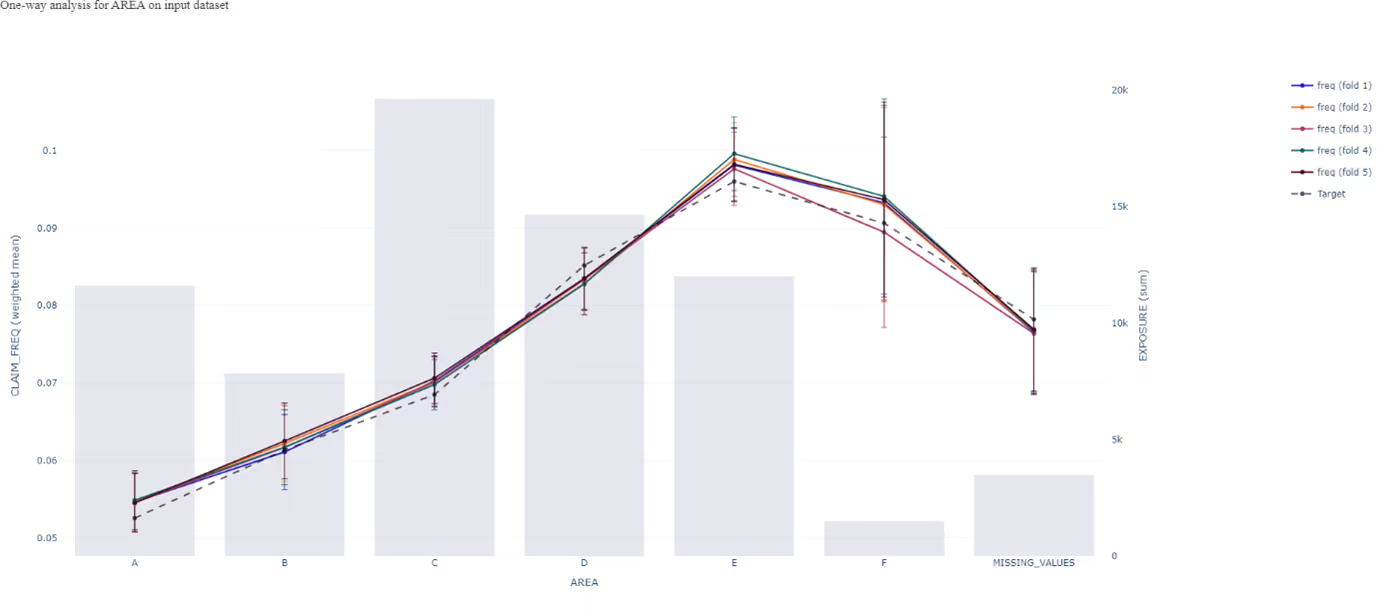
The example above can be extended to bias detection. If one fold’s model consistently predicts higher values for a particular group, that might indicate bias due to overfitting in that fold. Multiple lines can reveal this pattern across folds. In case the bias can be spotted and is consistent across all or most of the folds, we talk about systemic bias. However, if a larger deviation happens only for one fold, we might attribute it to overfitting.
In some cases it also makes sense to analyse the prediction range and variability. This approach might be particularly useful with demand models where the range is contained in the [0, 1] interval and a slight shift in the prediction range can have a huge impact on the price optimisation. Let’s reiterate it here that in the case of a demand model, we want strong consistency over folds and not necessarily over time. A box or ribbon plots are best choices here.
Thinking beyond
Cross-validation although powerful is not the only way to analyse model stability. Drift analysis is another method, however I believe it deserves its own article. What other methods do you use in your stability analysis? Let us know your approach!
%2520(1).avif)